Thursday, October 27, 2016

6 Shot System

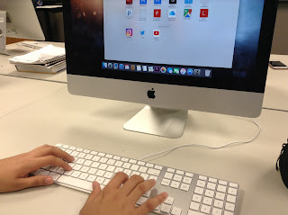
Hands Close-Up

This is shows a lot of detail rather than a wide shot. The angle just shows what the person's hands are doing. In Juan's situation, he is typing.


Face Close-Up

This not super close-up, but it is close enough to show the person's emotions. 


Over the Shoulder (OTS)

This shot is behind the person. It is showing what the person is looking at in front of them. Juan is looking at the computer.


Medium Shot

This shot introduces what the person is doing and where he is at. It is mainly the person's upper body. 


Wide Shot

This is shot father away from the person. It shows more of the setting and the whole body of the character. Juan's whole body is shown, and we see that he is in Mr. Cooper's room.


Extra Wide Shot

This is the last shot. It shows everything that is going on and what the character is doing. It is the widest and farthest away from the person. We now understand fully what is going on in Mr. Cooper's classroom.


Tuesday, October 25, 2016

Social Media Article Reflection

Reflection

I found it interesting (and a little creepy) that colleges often search your social media background to see if you are the type of person they'd want to admit into their college. Most students don't realize that what you put out there on social media can't REALLY be deleted. There will people that take screenshots, or save the picture or text message, or whatever. So be careful what you post! You don't want your social media background to come back to haunt you when college admission time rolls around. 

How Can We Avoid This?

Just don't post it. Or send it. If you are silently debating about whether you should post it or not, just don't. A good rule that I learned a while ago from someone was, "post what grandma would post". If you think about this, it's a pretty good rule! Your grandma probably would post about your achievements, or a good family picnic, or a walk with the dog. 99% of the time, she would post the right thing. So follow that example! Post about your achievements and fun times! Don't post things related to alcohol or other inappropriate subjects. No one likes to see inappropriate posts, and therefore it ruins your reputation. 


What I Would Do

I would be more careful with what I post. It would be terrible to have something you posted in 8th grade ruin your college admission process! "Post what grandma would post" is a great rule that I will try to follow. Also, texting or commenting hurtful things could still hurt your reputation as well, so I'd be thoughtful in what I say! I'd start sending more positive texts/comments. 

Just be smart about what you post!

Tuesday, October 18, 2016

Elevator Pitch

I'm an e-Comm student at ONW that has a talent for writing. My teachers have complimented me on my creativeness and writing skills. I'm trying to find ways that I can use my skills for entertainment video at ONW. I am inspired by well-written T.V. episode scripts and creative short films. I now want to use my abilities to impact our school.

Thursday, October 13, 2016

3D House Animation

3D Modeling & SketchUp

In a 3D modeling program called SketchUp, we have been creating a 3D house using almost all the tools such as: the erase tool, push/pull, tape measure (guides), pan, offset, move, rectangle and square tool, arcs, line tool, paint bucket, shadows, follow me, scenes, and orbit. The main tools I used for adjusting the angles that I was seeing the house at were orbit, which allowed you to "orbit" around in a circle, pan, which allowed for side-to-side movement, and zoom, which is pretty self-explanatory. To make objects 3D, you would first draw an object with the line tool or draw a shape. Then, using the push/pull tool, you would push to hollow out the object, or pull to bring it out into 3D. This tool was the most important for making things 3D. The paint bucket would then be used for filling in the object with color. To make objects an exact size, you could use the tape measure to measure the distance between edges and so on. Finally, we used shadows to make the scene even more realistic (because it means that there is a sun). The different scenes were actually used to animate the entire house, showing different angles of the house. SketchUp was really cool in that it animated the movement in between set frames. 

That was a lot, but this project certainly taught me a bunch about 3D modeling! I definitely didn't know that a simple house could take this much work. The question is... what 3D object will I make next?


Wednesday, September 28, 2016

My 10 Strengths Video Animation

The Process

First, we put our 10 strengths in the side gadget on our blog. Then, we got a picture (copyright free) off the Internet and put in Photoshop as the background. We added a text layer for each strength on top of the background (using typeface, colors, sizing, etc.). This step took a while because we had to arrange the words in a somewhat good order. We also had the option of changing the image with brightness, contrast, and hue. Then, we started animating the words on the video timeline. To start off, the "fade with black" tool was used for fading in the opening image (without words). The words were animated using the "transform" keyframes, where Photoshop automatically animated the word movement from start to finish on each word layer. Pretty cool! The ending also had a "fade with black" added on.

What's New?

The new tools that we used in Photoshop were the video timeline, fade with black, and transform keyframes. The video timeline was different than last project's frame animation timeline. To start off the animation, we used fade with black to gradually bring in the scene. This was similar to the "tween" tool used in frame animation. Finally, we used transform to set certain keyframes that moved a certain way. Photoshop animated the movement in between your start and end frame! The animation could have been flying in, fading in, shaking, going in a circle, and so on.

Next Time

I would make better animations for the text frames next time. Some of my animations were not very smooth, or looked out of place, so I would make them better if we did this again. Yet, I would still keep the same layout and background because I liked how the words were arranged around the field. This would be something that I would the keep the same next time. 

Here is the video animation of my 10 strengths! (Like, subscribe, and share of course.)

Tuesday, September 20, 2016

Bouncing Ball Animation Using Arcs

The Process

For the first part of the project, we created layers such as our name, the ground, the sky, and the two types of balls. You know, the basic stuff. Then, we made drew an arc layer to use as a guide for the animation. After that, we created endless layers of bouncing balls, using ease in and ease out and squash and stretch. That was the longest part of the project! Then, after the long process of the creation of the ball layers, we made a "curtain" using the paint bucket tool to slowly fade in the scene of the bouncing ball. This layer went on the beginning and end of the animation. Just like the last project, we used the timeline to animate the bouncing ball, and used the "tween" tool to slowly fade in the scene. Finally, we saved for web, and got to post it down below!


New Things in This Project

In this project, we learned the arc principle of animation and the "tween" tool in the timeline of photoshop. For starters, the arc was used as a guide to help the bouncing balls stay on some sort of track. It helped map out the animation. We drew this by making a new layer and drawing the arcs using the "paint brush" tool. The ball had to bounce it little lower each time in order for the animation to look somewhat realistic. Then, when finished creating the layers, we slowly faded in the bouncing ball scene by using the "tween" tool for the "curtain" (paint bucket-filled layer). These few new tools and principles helped make the animation better than last time, and they looked more real!

Next Time?

If we did this project again, I would probably mess around with the "no dither" when saving the animation for the web. The options, such as "selective" and "adaptive" could have helped the animation colors look better, since it doesn't blend very well. I would also try to get the bounce to stop sooner so I could add some other cool twist at the end.

Overall, the results were better than last time!

Here is a video to learn more about the animation principle of arcs:

Thursday, September 8, 2016

Bouncing Ball Animation Project

The Project Overview

Over the past week, we have been animating a bouncing ball using Adobe Photoshop. We created layers such as the ground, sky, and ball and added gradients to them to make it look more realistic. We then created ball layers to make the ball look as if it was moving, using animation principles such as squash and stretch and ease in and ease out. Then, we used the timeline to actually make the ball bounce, cutting some duplicate layers to make the animation look smoother.  After we successfully made the ball bounce, we changed the file to a GIF file so we could post it here!

Have I Learned Anything?

Yeah, you could say I learned a little about animation and Photoshop. To start off, I hadn't ever used Adobe Photoshop. I'd used photo editing apps that used layers and cool tools like that. But nothing like Photoshop. While animating the ball with the "timeline" in Photoshop, I learned about some basic principles of animation: squash and stretch and ease in and ease out. Squash was used to show the impact of the ball hitting the ground, and stretch was used to make the ball look as if it sped up. Ease in and ease out was based on slowly spacing out each ball frame to make it speed up or slow down. Regarding the layer editing part of the project, I learned to add gradients to the ground, sky, and ball to make them look more realistic. I also learned how to draw shapes such as the ball, and make a perfect circle (using the option key).

 Next Time

If we did this project again, I would probably focus more on the gradients of the layers and making a better background (clouds, sun, etc.). I could probably touch up the animation's frames as well. You know, to make it look smoother. Finally, I would make the ball start higher in the air so that I could get at least 7 or 8 frames of the ball before it hit the ground. The color and gradient of the ball is one thing I would keep the same though, because it looks 3D enough. I'd also keep the placement of the ground the same, because it should probably take up 1/3 of the portrait. The overall design of my project looked good, but some little things need tweaking to make it even better.

Eventually, the ball will turn purple, I promise. Make sure to look out for it!